
Crafting a Unified library
From Chaos to Cohesion:
Beinleumi’s bank design system journey
DSM Management
Use case
Figma
THE TALE BEGINS
Embark on a UX journey, guiding scattered files towards a unified design library. In this adventure, we introduce responsive components, working guidelines, and a shared design language, all crafted to enhance collaboration and productivity.
This project is part of my responsibilities/roles as overall library management - from company templates to a project’s design kit - this use case showcases our process with one of our offices main clients.
The problems
1
Keeping up with everything
Different files led to inconsistencies in the user interface, making it a challenge to maintain a cohesive and polished look and feel.
2
Keeping up with everything
Different files led to inconsistencies in the user interface, making it a challenge to maintain a cohesive and polished look and feel.
3
Keeping up with everything
Different files led to inconsistencies in the user interface, making it a challenge to maintain a cohesive and polished look and feel.
The Quest The Hypothesis
Transitioning to a unified design system will address workflow inefficiencies, reduce inconsistencies, and enhance collaboration between UX/UI and development teams
Journey of discovery
The current situation System audit
We collected component sets from main project files. This systematic review helped us address issues like inconsistent UI, design drift, outdated information, and clutter.
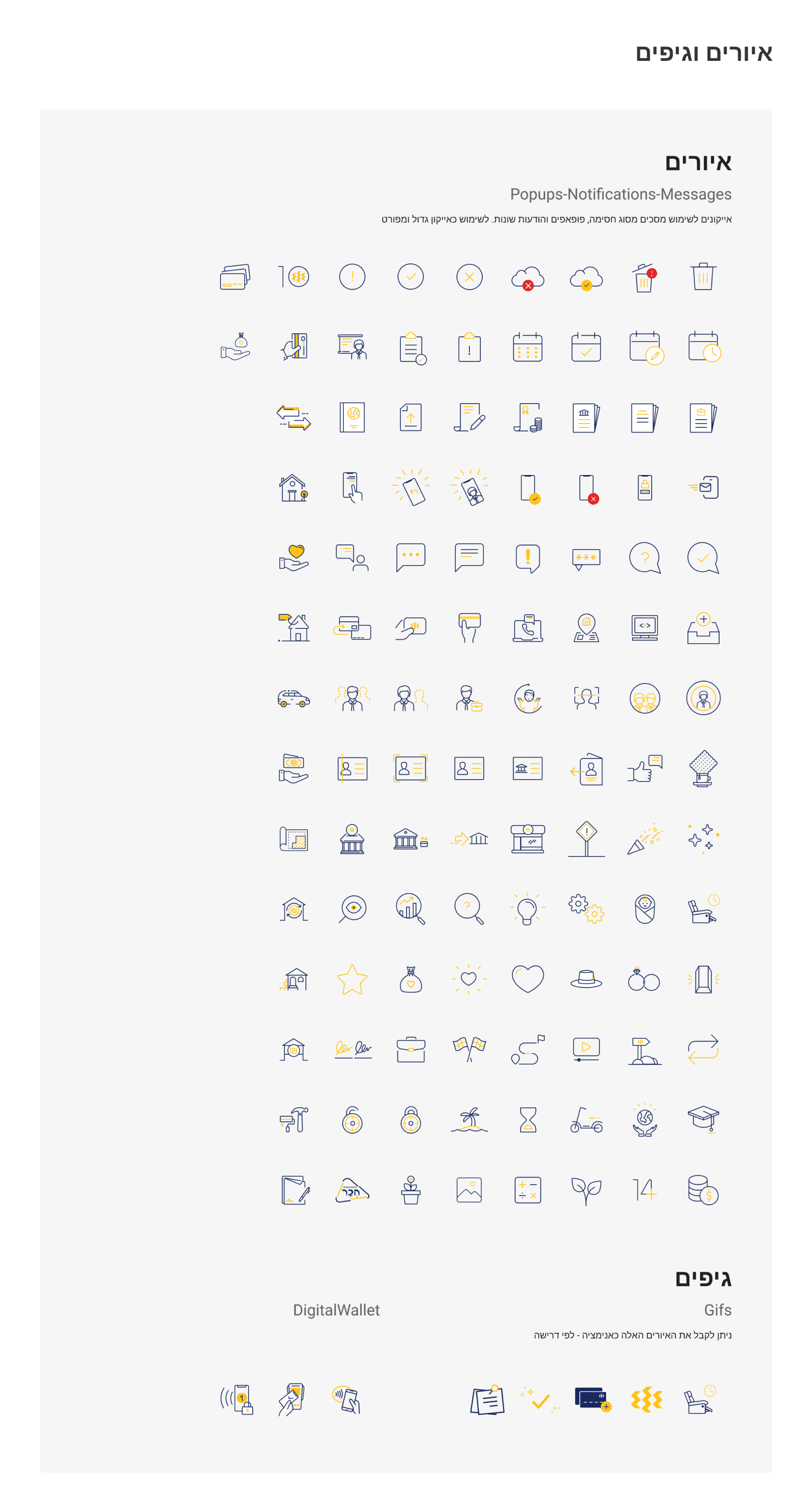
The theory Atomic design
We adopted the theory of atomic design, breaking down design systems into their smallest, reusable components, similar to atoms. This approach aligns seamlessly with our UX/UI workflow challenges, offering solutions to inconsistent UI, component duplication, limited reusability, and style guide maintenance.
The Benchmark Inspirations
Drawing inspiration from various sources enriched our system's foundation, fostering creativity and efficiency as we constructed a unified and harmonious design system.
The enchanted outcome
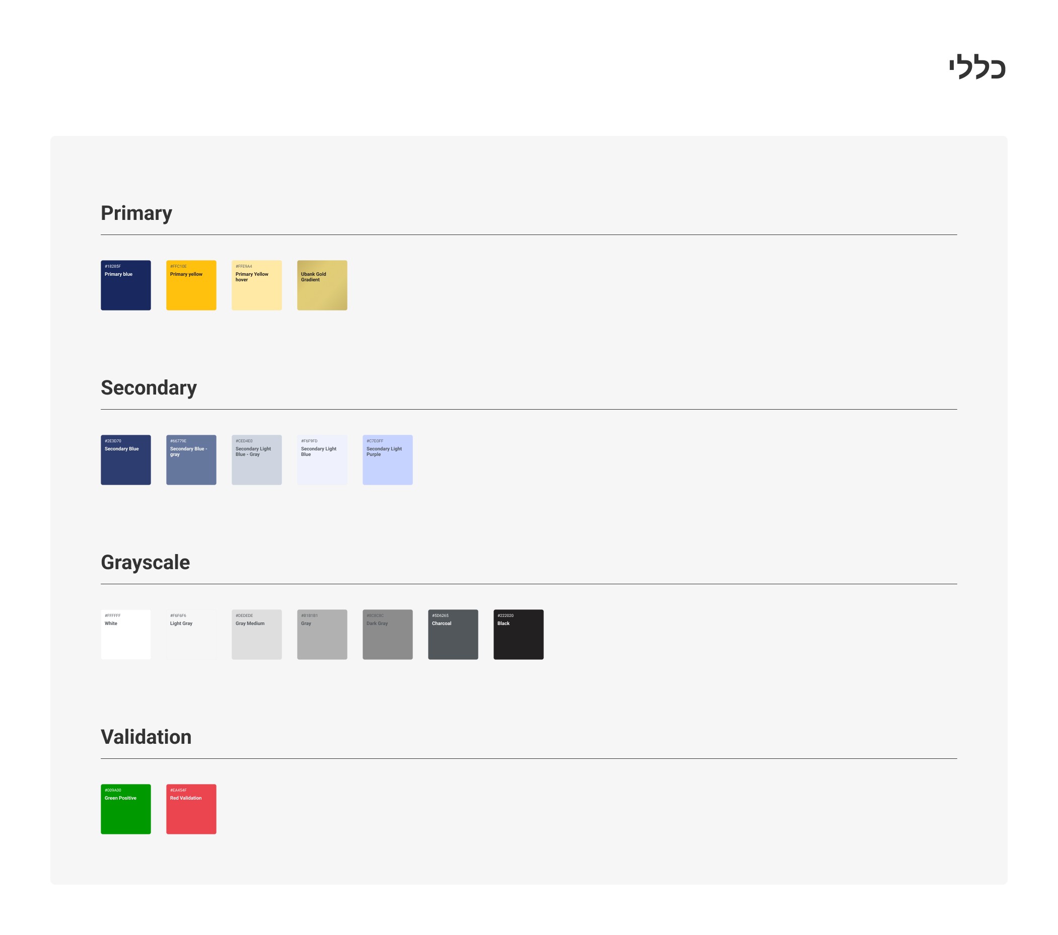
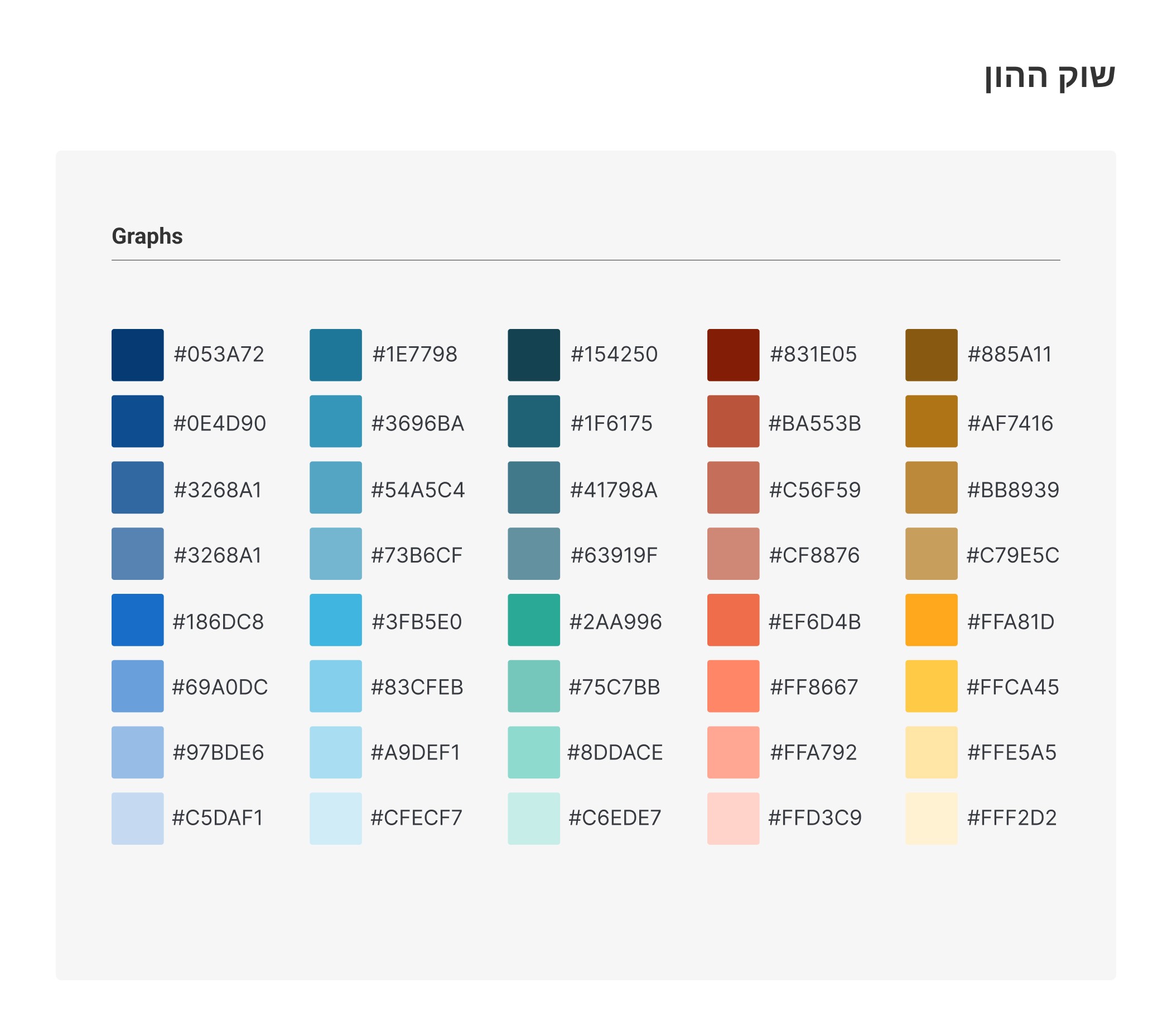
As we conclude this phase of our journey, we proudly present the first version of our design system. This transformative adventure allowed us to conquer the challenges of inconsistent UI, component duplication, and limited reusability. Our design system now serves as a guiding light towards a more harmonious and efficient workflow.
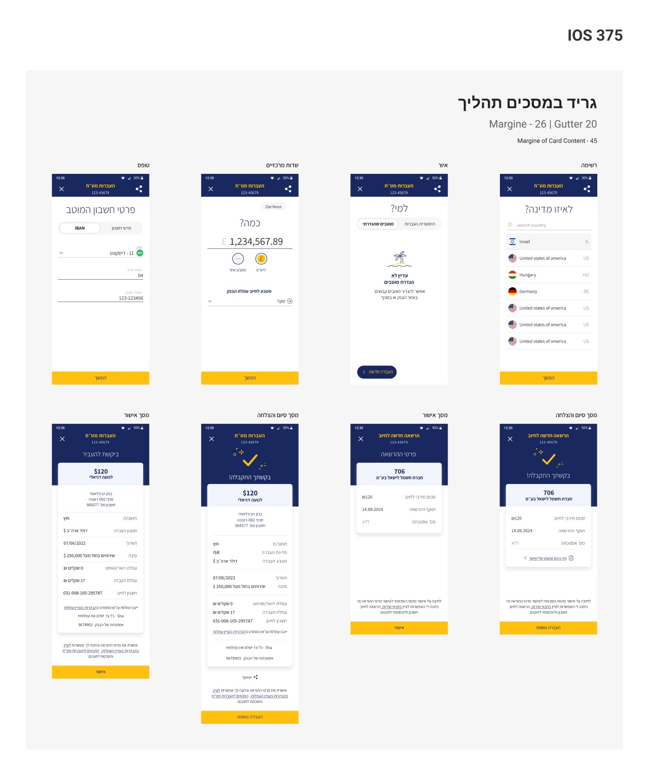
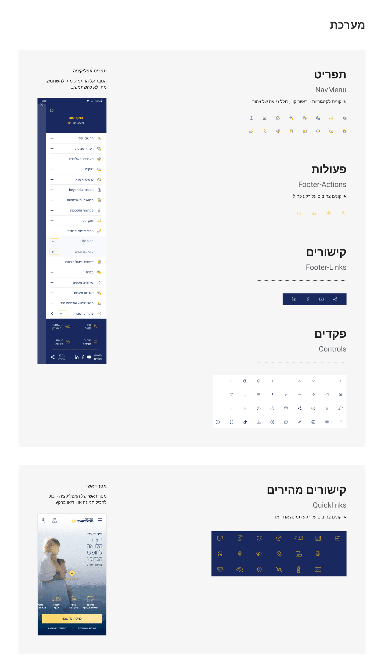
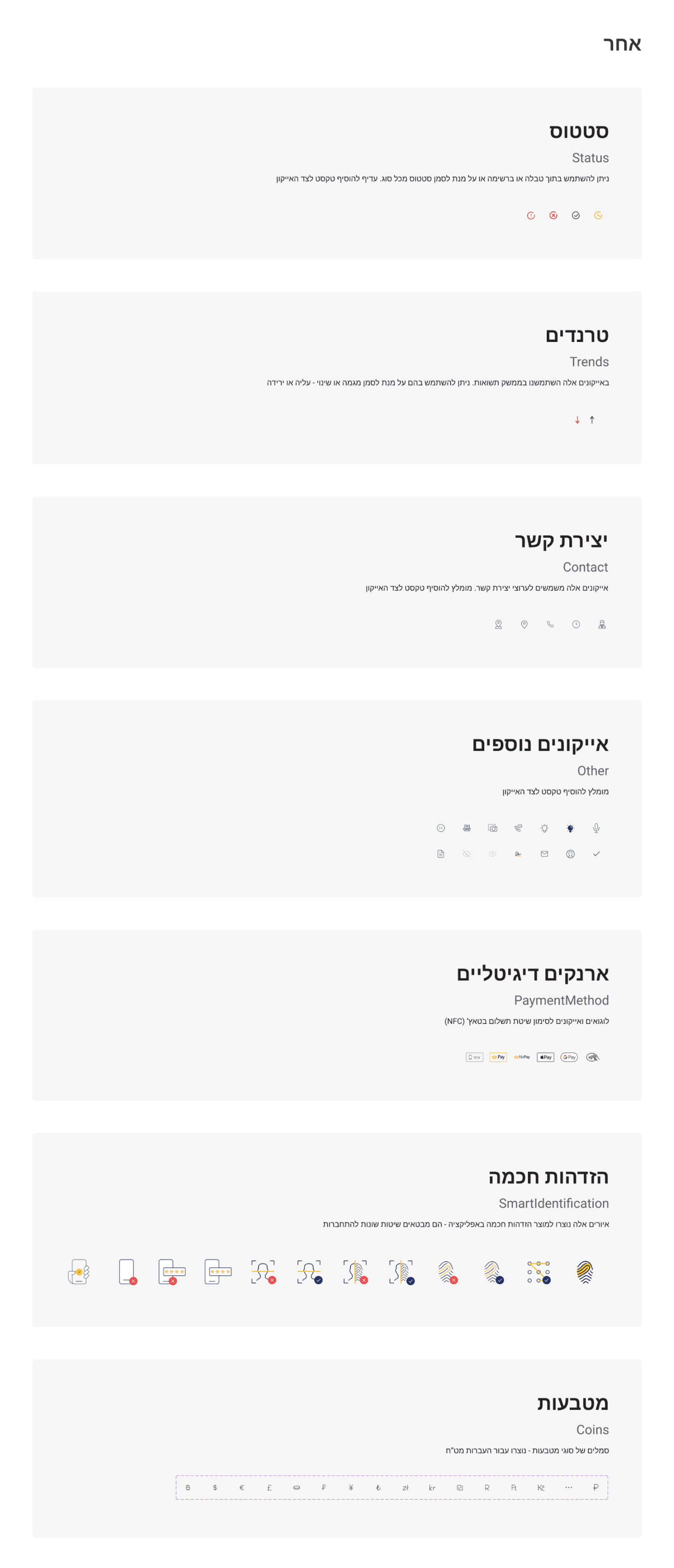
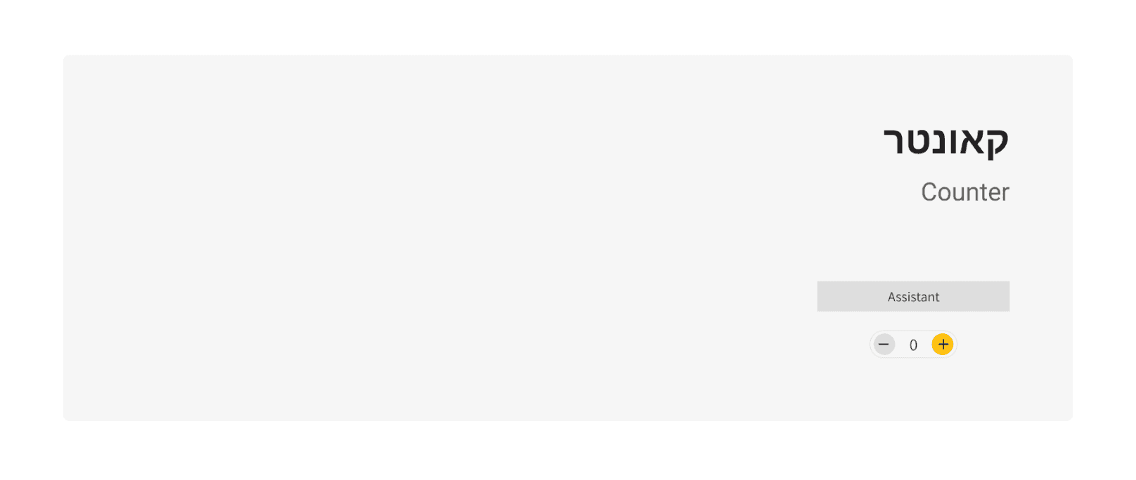
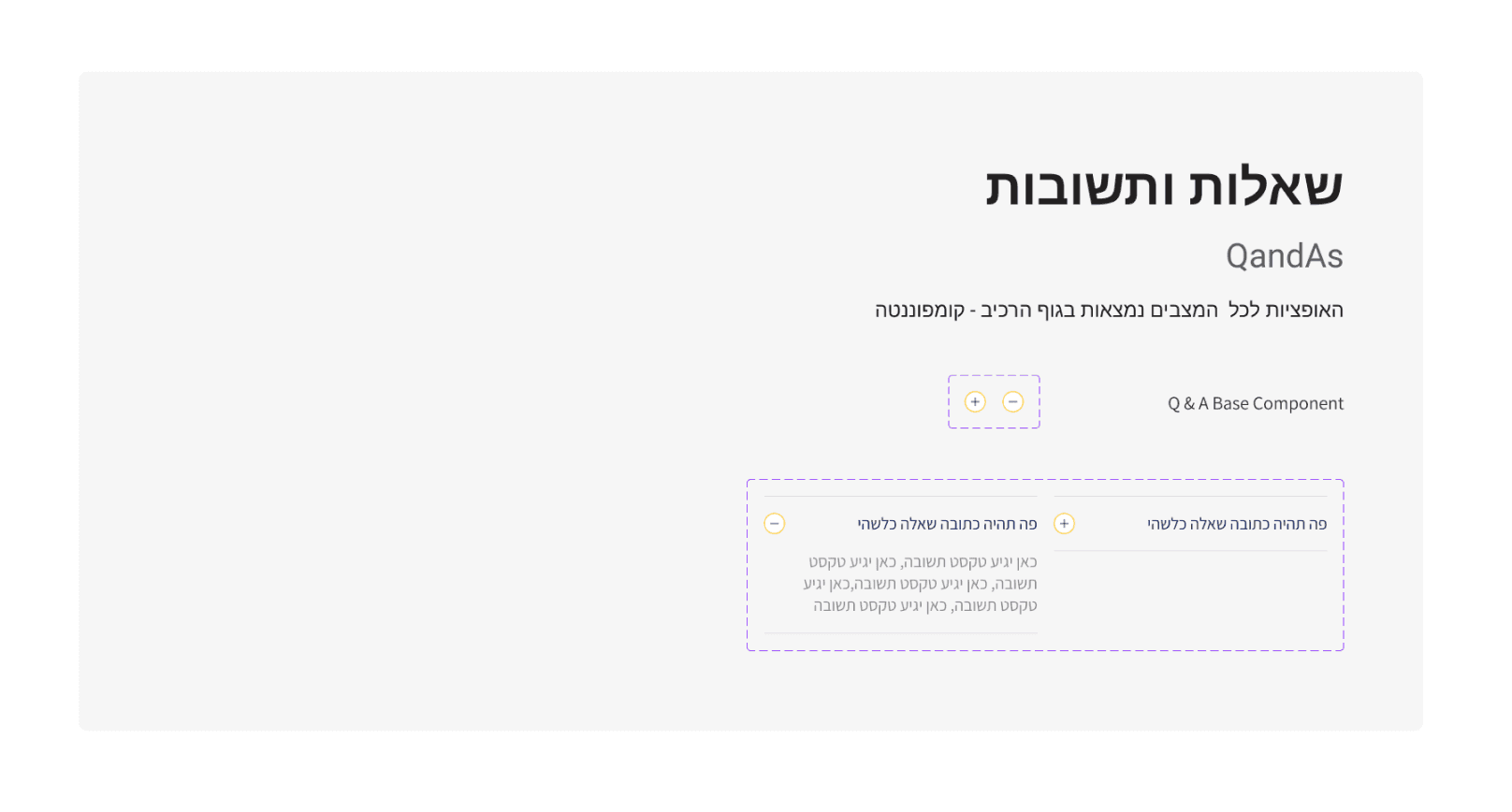
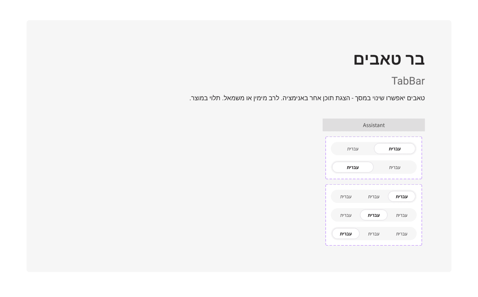
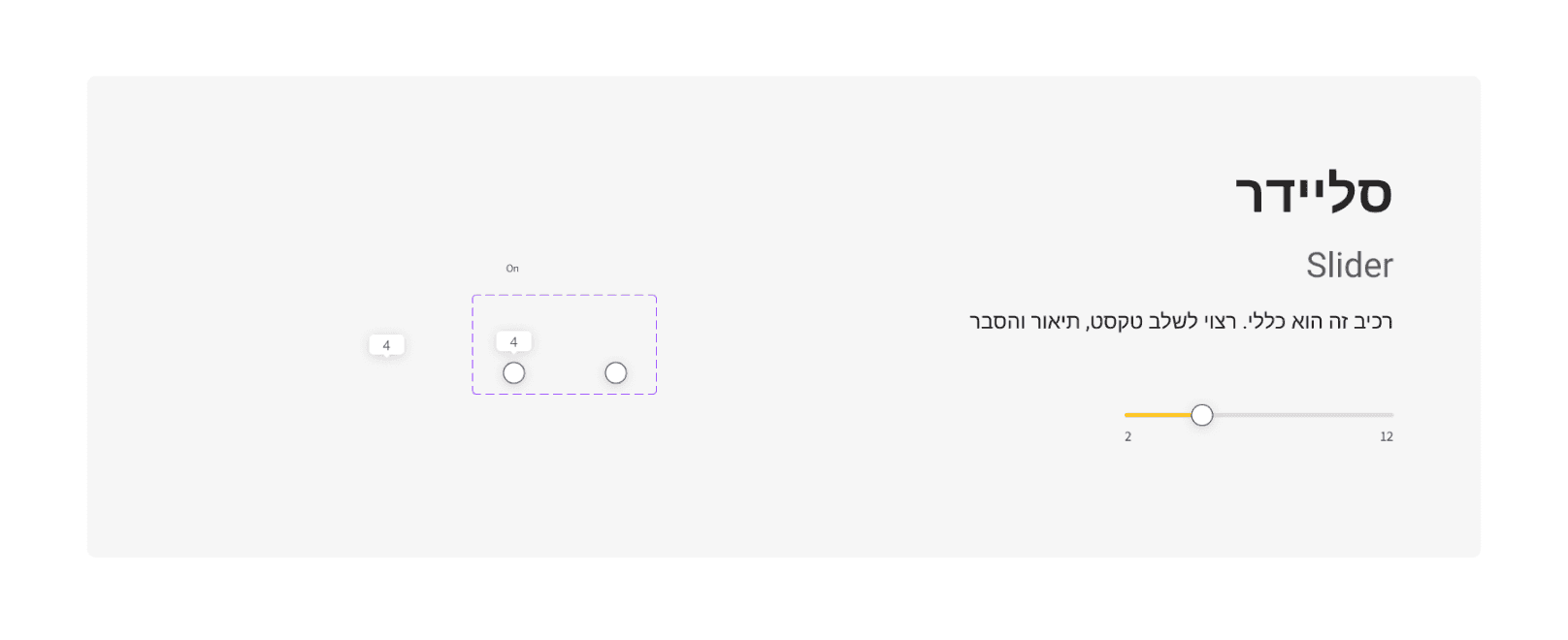
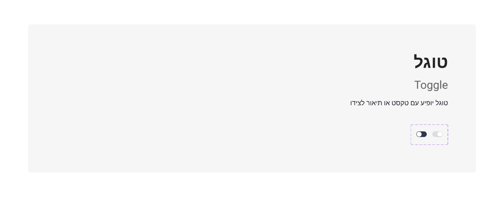
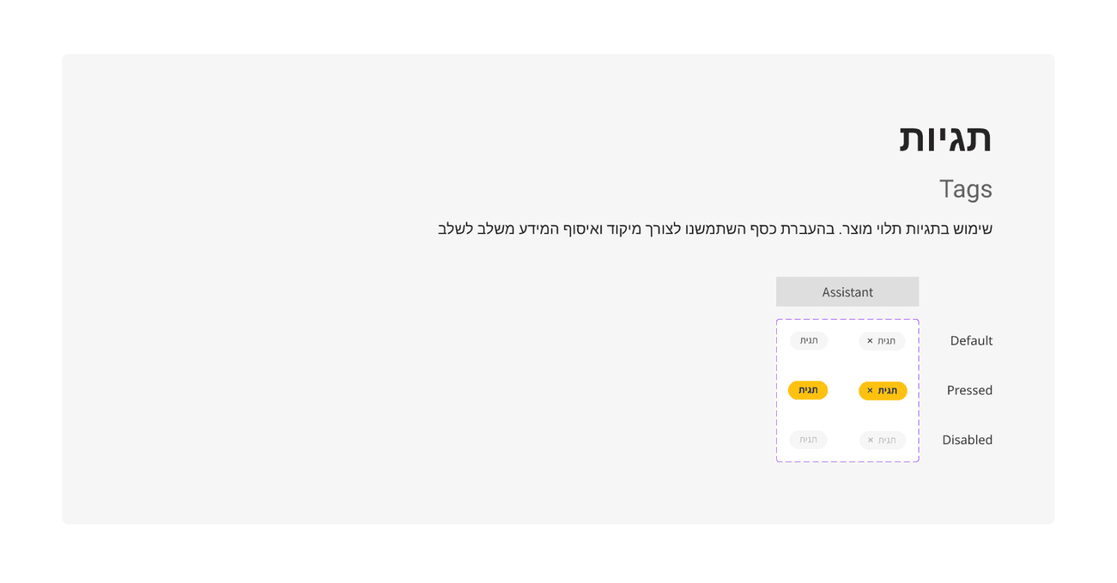
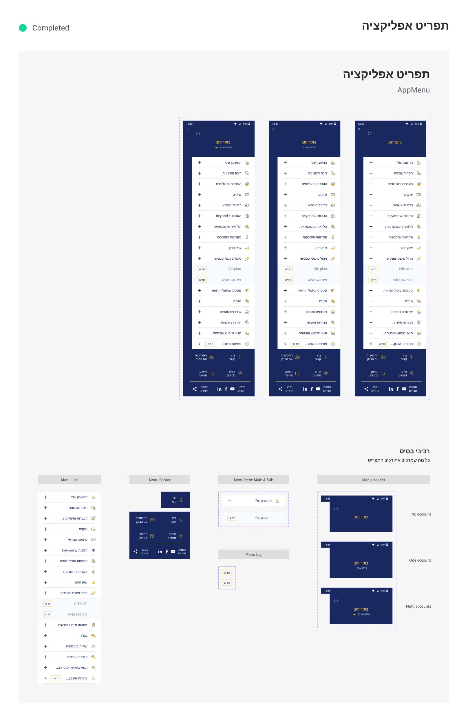
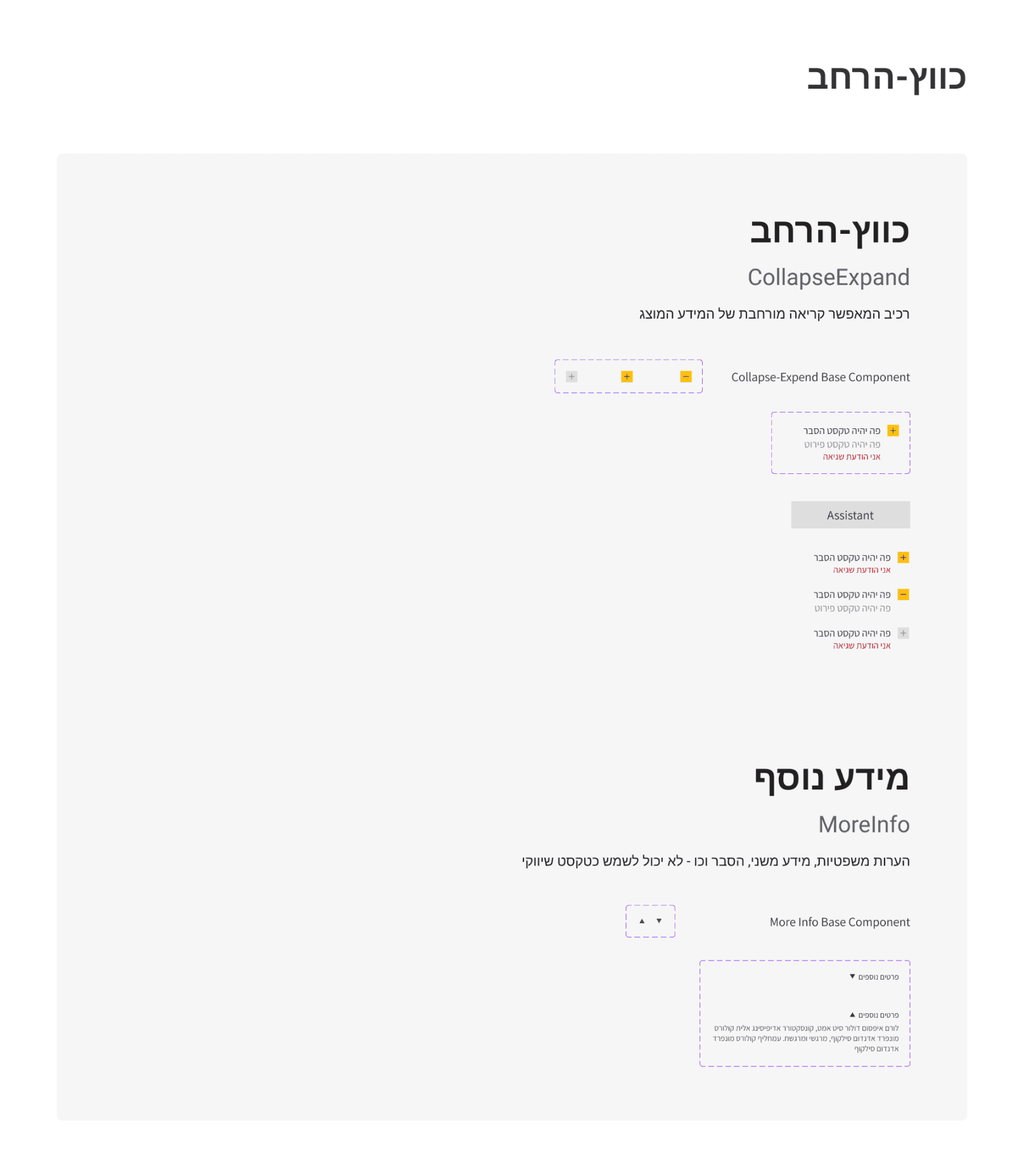
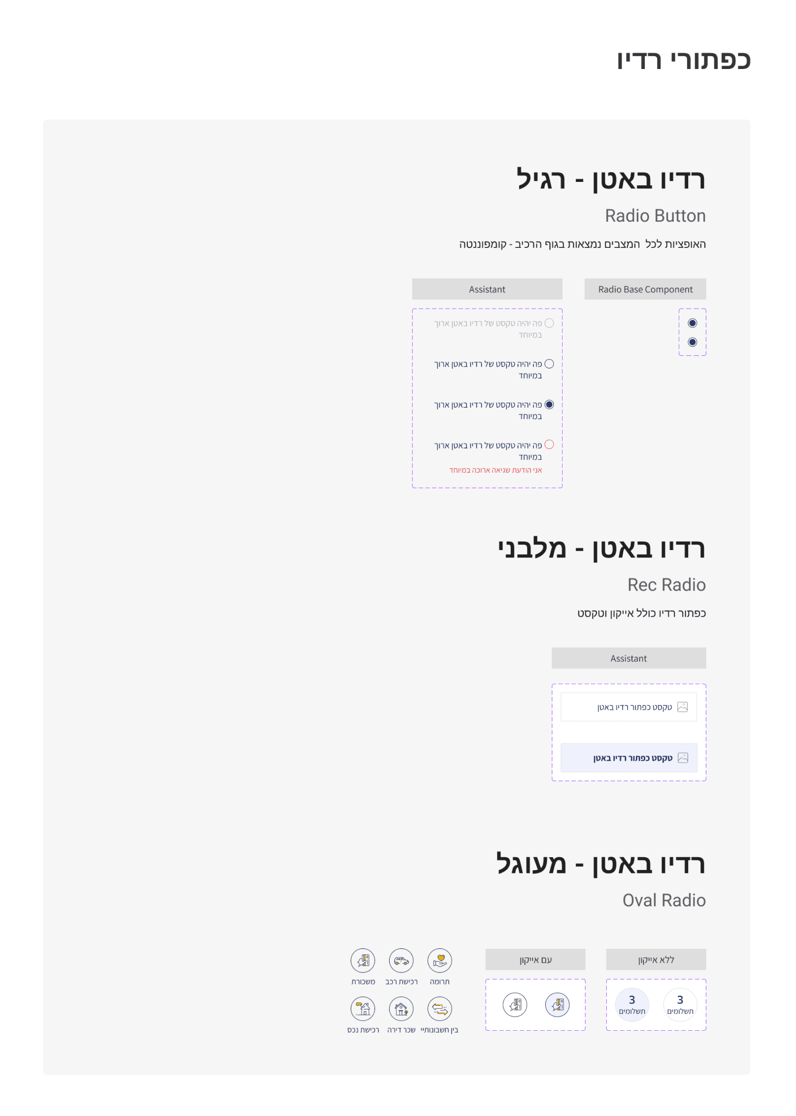
Library structure
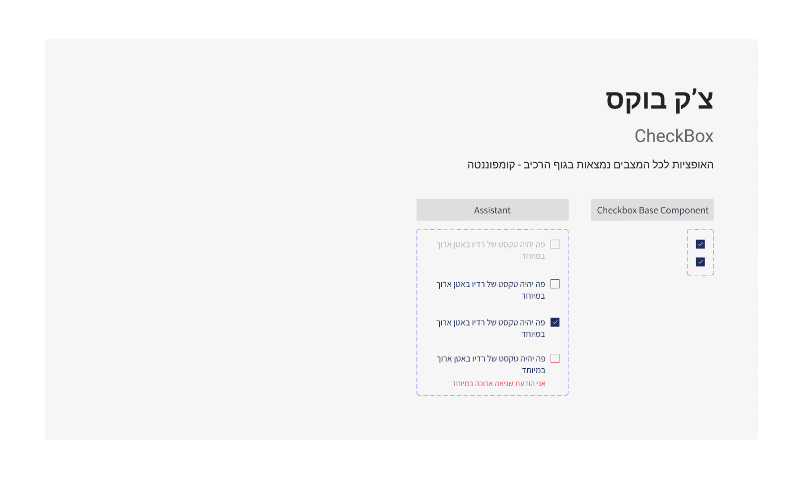
Our library structure consists of Pages, Sections, and Sets, enriched with explanations, examples, different naming options, indexes, and more. These additions help users find what they need and understand how to the components.
How we use it
Navigating through our library is becoming a breeze, from searching and browsing in the "Assets" panel to accessing the main component in the actual library file. Users can explore, review other sources of the same type, and even leave comments for improvements.
Never ending story
Our journey continues, and we eagerly anticipate the evolution of our design system. This ongoing adventure promises more efficient work processes and improved collaboration, ensuring that our story remains evergreen.
Let’s talk
(+972) 52-362-1518
mayag86@gmail.com
Crafting a Unified library
From Chaos to Cohesion:
Beinleumi’s bank design system journey
DSM Management
Use case
Figma
THE TALE BEGINS
Embark on a UX journey, guiding scattered files towards a unified design library. In this adventure, we introduce responsive components, working guidelines, and a shared design language, all crafted to enhance collaboration and productivity.
This project is part of my responsibilities/roles as overall library management - from company templates to a project’s design kit - this use case showcases our process with one of our offices main clients.
The problems
1
Keeping up with everything
Different files led to inconsistencies in the user interface, making it a challenge to maintain a cohesive and polished look and feel.
2
Keeping up with everything
Different files led to inconsistencies in the user interface, making it a challenge to maintain a cohesive and polished look and feel.
3
Keeping up with everything
Different files led to inconsistencies in the user interface, making it a challenge to maintain a cohesive and polished look and feel.
The Quest The Hypothesis
Transitioning to a unified design system will address workflow inefficiencies, reduce inconsistencies, and enhance collaboration between UX/UI and development teams
Journey of discovery
The current situation System audit
We collected component sets from main project files. This systematic review helped us address issues like inconsistent UI, design drift, outdated information, and clutter.
The theory Atomic design
We adopted the theory of atomic design, breaking down design systems into their smallest, reusable components, similar to atoms. This approach aligns seamlessly with our UX/UI workflow challenges, offering solutions to inconsistent UI, component duplication, limited reusability, and style guide maintenance.
The Benchmark Inspirations
Drawing inspiration from various sources enriched our system's foundation, fostering creativity and efficiency as we constructed a unified and harmonious design system.
The enchanted outcome
As we conclude this phase of our journey, we proudly present the first version of our design system. This transformative adventure allowed us to conquer the challenges of inconsistent UI, component duplication, and limited reusability. Our design system now serves as a guiding light towards a more harmonious and efficient workflow.
Library structure
Our library structure consists of Pages, Sections, and Sets, enriched with explanations, examples, different naming options, indexes, and more. These additions help users find what they need and understand how to the components.
How we use it
Navigating through our library is becoming a breeze, from searching and browsing in the "Assets" panel to accessing the main component in the actual library file. Users can explore, review other sources of the same type, and even leave comments for improvements.
Never ending story
Our journey continues, and we eagerly anticipate the evolution of our design system. This ongoing adventure promises more efficient work processes and improved collaboration, ensuring that our story remains evergreen.
Let’s talk
(+972) 52-362-1518
mayag86@gmail.com